Practical Ergonomics Applied To Smart Switch Design

Founder, Nuro Technologies
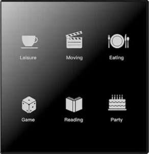
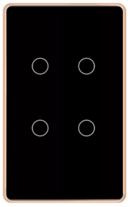
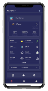
We have seen several products in the Smart Switch market that try to succeed by making the switch sexy with a touchscreen and/or touch (multi gesture) interface. While this appears ‘neat’ at first look, consider the height placement of a switch that must meet code requirements. This height is too low to operate a touchscreen or touch panel comfortably, unless you are a hobbit and a short one at that. It also presumes you are going to walk up to the switch to operate it. Why? Doesn’t that defeat the purpose of a smart switch and presume that we aren’t already carrying an advanced smartphone with us? Why burden the consumer with the expense of the sexy look for every switch, consider a modern house that can easily have 50 or more switches.

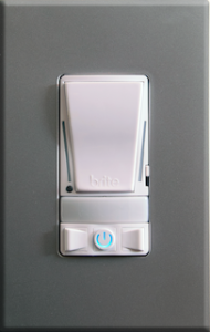
A truly smart light switch should typically operate without the need for intervention and on the occasion where you need to physically interact with it, it should be intuitive and tactile. You click the rocker up or down and you have a tactile feel and response to confirm operation. Compare this to a touch interface that requires you to visually verify where you have placed your fingers and that you have performed the correct gesture/action.
The physical and tactile rocker switch is understood by everyone, from a child to a grandparent. It is multi-generational and completely intuitive in function. After all, it’s “just a light switch”, you should be able to operate it as one.


